SHE SO
SHE SO
紫蘇のポテンシャルを大切にする女性向け食品ブランドのロゴブランディング
【ハーバルフィッシュプロジェクト】
紫蘇(しそ)の茎の部分は本来なら廃棄してしまうが、それを養殖魚のエサとし有効活用し
そのエサを食べて育った魚たちを食用として販売するプロジェクトの一環の「SHE SO」プロジェクトのロゴデザインを担当した。
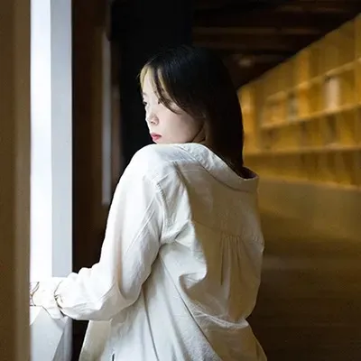
SHE SO(シーソー)は、美容や健康を意識している女性に向けた製品。これを取り入れることで、自分自身で「美」を実感できるだけでなく、「彼女はとても綺麗になった」「彼女は魅力的になった」「彼女は可愛くなった」と周りからも感じてもらえるような食品を目指している。
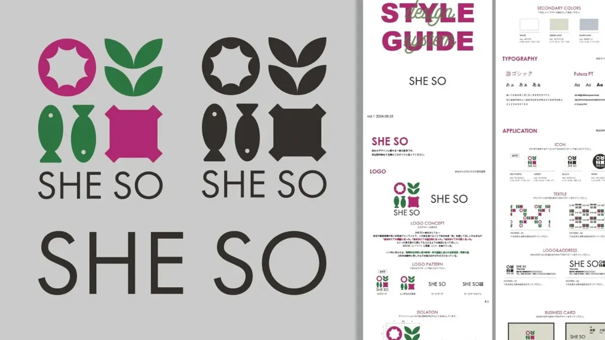
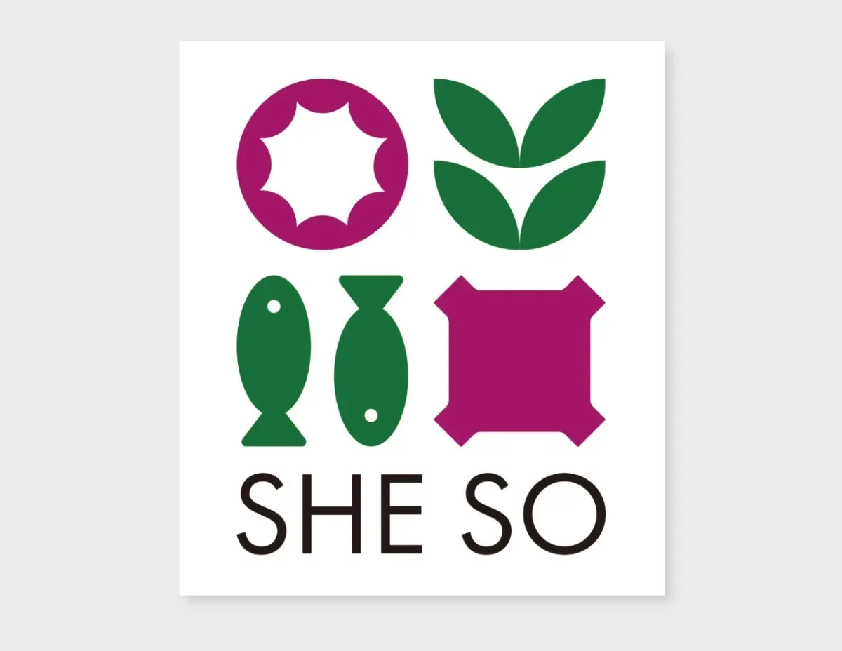
SHE SOという名前は、紫蘇(シソ)と掛け合わせており、紫蘇の持つ健康的なイメージを大切にしている。ロゴはシソ科の特徴的な四角い茎の断面や、双子葉類に見られる維管束、紫蘇の葉を抽象的に表現し、これらを組み合わせたデザインになっている。
SHE SOは、健康と美しさをサポートし、日々の生活に魅力をプラスする製品。
"Logo branding for a women's food brand that values the potential of Shiso."
【Herbal Fish Project】
The stems of perilla (shiso) are usually discarded, but in this project, they are repurposed as feed for farmed fish, which then grow and are sold as food. I was responsible for the logo design of the "SHE SO" project, which is a part of this initiative.
SHE SO is a product designed for women who are conscious about beauty and health. By incorporating it into their lives, not only can they experience "beauty" for themselves, but they can also inspire others to say, "She looks so much prettier," "She has become more attractive," or "She looks so much cuter." This is the kind of food we aim to create.
The name SHE SO combines the concept of purple perilla (Shiso), emphasizing the healthy image associated with it. The logo abstractly represents features like the characteristic square stem cross-section of the perilla plant, vascular bundles found in dicotyledons, and the leaves of the perilla, all brought together in a cohesive design.
SHE SO supports both health and beauty, adding an extra layer of allure to everyday life.
Cliant
高浜町産業振興課 様
Logo Deisgn VENI
VENI