まいづるグッドカンパニー
まいづるグッドカンパニー
若い世代がイキイキ働ける、市内の企業を魅力的にPRするブランディング
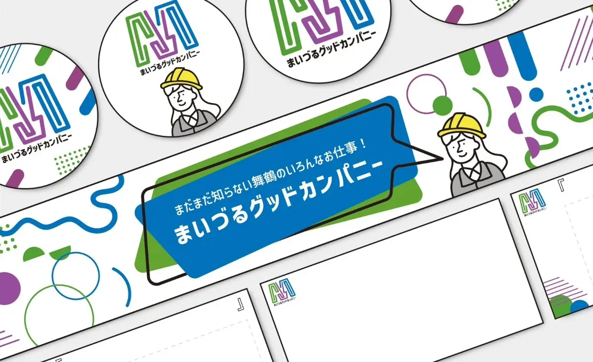
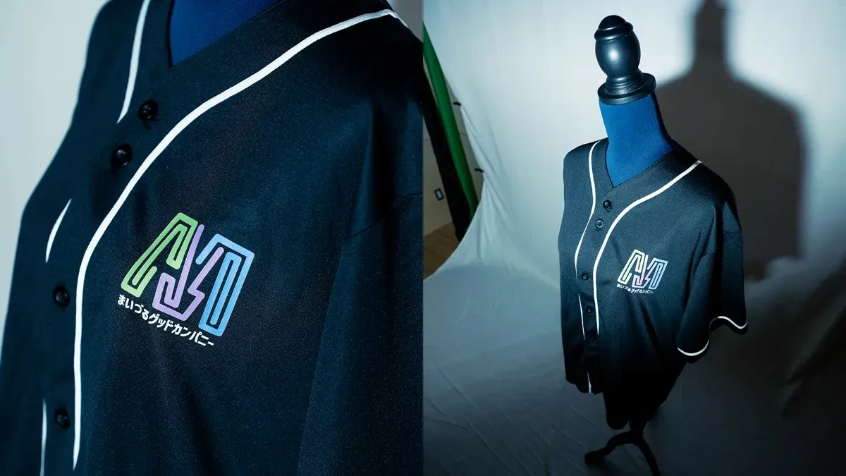
舞鶴市の新規事業「まいづるグッドカンパニー情報発信事業」で、ウェブサイトのメイングラフィックデザインを担当。チラシ、ロゴのデザイン、ユニホーム作成を行った。事業の目的は、舞鶴市内の企業が自社の技術やサービスを再確認し、それを発信すること。
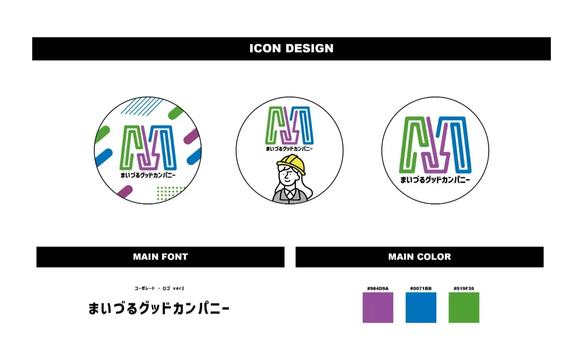
デザインでは、既存の情報発信局「DESIGN WEEK KYOTO in 丹後・中丹」のイメージカラーを踏襲し、若さや楽しさを感じさせるポップで丸みのあるスタイルを採用。舞鶴で若い世代がイキイキと働けるイメージを与えることを意識した。
さらに、舞鶴の仕事を紹介するバスツアーを企画し、一般向けと高校生向けの2種類のツアーを実施。チラシデザインは、ターゲットごとに異なる印象を与えるよう工夫。一般向けには「まいづるグッドカンパニー」のメインカラーである緑、紫、青を使用し、高校生向けには反対色のピンク、黄色、オレンジを採用。仕事に対するワクワク感を感じてもらえるデザインを意識した。
また、まいづるグッドカンパニーの公式noteでは、舞鶴市内の様々な職業が異なる視点から紹介されている。
”A graphic design that effectively promotes local companies in Maizuru, showcasing them as appealing places for young people to thrive and work with energy”
We were responsible for the main graphic design of the website for the new initiative, "Maizuru Good Company Information Dissemination Project." The goal of this project is for companies within Maizuru City to reassess and promote their technologies and services.
For the design, I drew inspiration from the existing color scheme of the "DESIGN WEEK KYOTO in Tango & Naka-Tanba" information campaign, while incorporating a playful and rounded style that conveys youth and excitement. The aim was to create an image of Maizuru where young people can thrive and enjoy their work.
In addition, I planned and designed promotional materials for a bus tour that introduces jobs in Maizuru. Two different tours were offered: one for the general public and one for high school students. The flyer design maintained a unified aesthetic while differentiating each target audience. For the general public, I used the main colors of "Maizuru Good Company"—green, purple, and blue—while for high school students, I used contrasting colors of pink, yellow, and orange. The overall design was intended to evoke a sense of excitement and anticipation about the opportunities in the workforce.
Additionally, the official Maizuru Good Company note features various professions in Maizuru City, offering a range of perspectives and insights.


Cliant
舞鶴市役所 様
Branding VENI

VENI