Brush up
Brush up
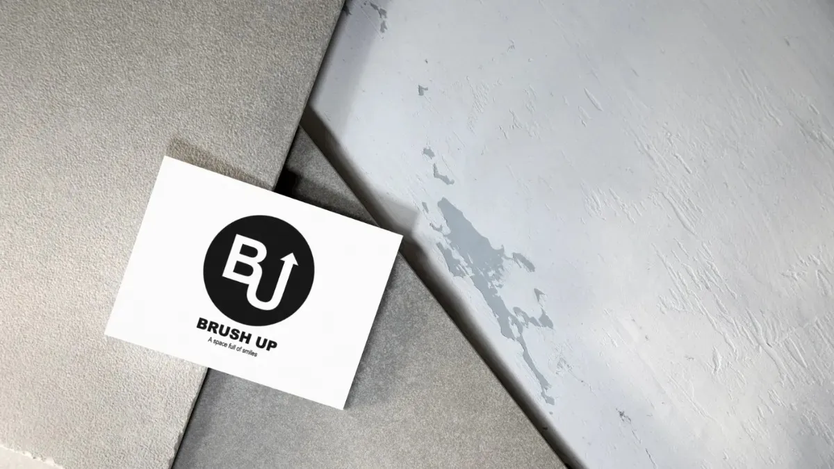
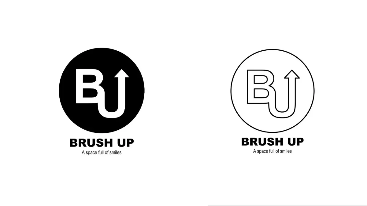
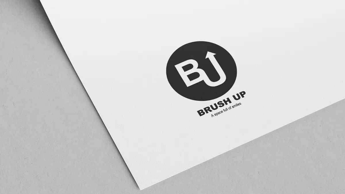
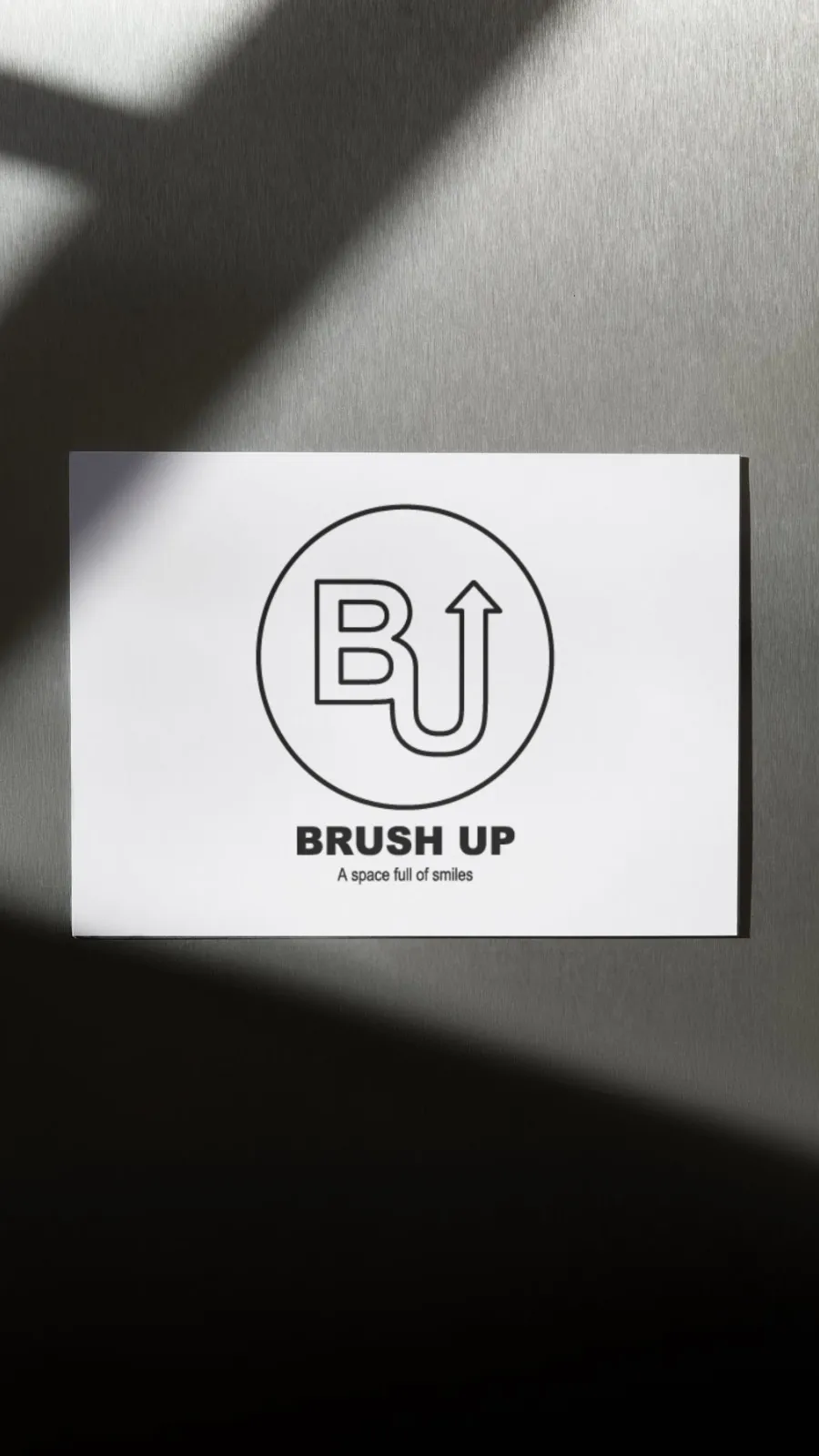
磨きをかけ上を目指すロゴ
studio808を運営している会社様のロゴ制作を担当。
「シンプルでかっこいい」という要望をもとに、BとUが繋がったような一体感のあるロゴを設計。Uの部分は「上がっていく」という意味を込めて、上向きの矢印として表現。
全体を円形にまとめることで視認性と汎用性を高め、名刺やグッズなど多様な媒体への展開がしやすい構造に仕上げた。
Responsible for designing the logo for the company that operates studio808.
Based on the request for a "simple and cool" design, a unified logo was created that connects the letters B and U. The U is represented as an upward arrow, symbolizing "rising" or "progress."
The overall design is enclosed in a circular shape to enhance visibility and versatility, making it suitable for various applications such as business cards and merchandise.
Cliant
Brush up 様

VENI